Formatting Content
Formatting content goes beyond just bolding text or making things look visually appealing. How you section off content, organize it, and the methods you choose to present it will all affect your visitors' experiences. Will you present your information in paragraph format, or throw in some lists and tables to help highlight important topics or data? You can have a flashy, state-of-the-art website, but if the content is no presented properly, your visitors may dislike their experience.
These factors also play a role in things like SEO. The proper use of elements such as the different headings will affect how non-human visitors will interpret your pages.
General Organization of Pages
For the most part, you will want to stick with a similar organization for your pages. The more consistent and predictable your site is, the easier a visitor will be able to find what they need. Usually, the quicker a visitor can get their information, the more satisfied they are.
Organization, as previously mentioned, will also affect things like SEO. On top of that, organization will make you and your co-worker's jobs easier, as you will not have to "re-invent the wheel" each time content needs to be added or changed. Since organization is so crucial, it is important to have an idea and possibly even a more formal standard in place before editing or creating too many pages.
Sample Organization of a Page
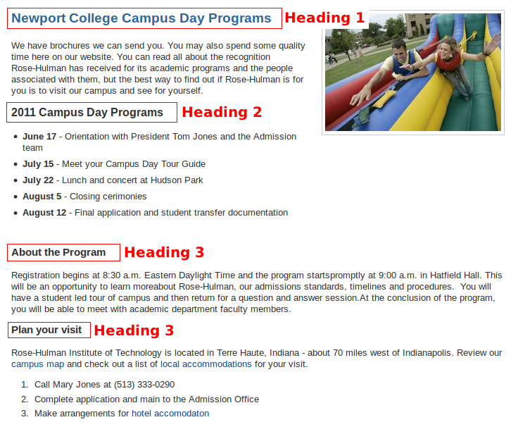
Below is an example of a sample organization scheme for pages. This is only an example, but it was made with good practices in mind (especially for SEO).

As stated, this is only an example. It may seem simple, but when it comes to web content, simple is good. Complex pages are hard for both people and computers to process and navigate.
The example may also seem boring in some ways, but that is not the case. Although the information is organized like so, things like floated images and styling can be incorporated to create a more visually appealing site while keeping good organization. As a rule of thumb, images and other extras should complement and be worked around the information, the information should never be worked around supplemental content. That is unless something like an image or whatnot is the key focus of a page.
This example also shows the use of "header 1", "header 2", and other "header" elements. Headers are a very important part of page organization, and have a significant effect on SEO. The documentation features a section dedicated to headers, and it is a suggested read.
Making Room for Your Content
The spacing of content is just as important as its organization (at least in regards to people visiting your site). Even the best organization scheme can be ineffective if all of the content is cramped together.
A significant part of spacing issues are dealt with by default in your site's CSS (styling) definitions. Only administrative people can access and change this file, and any changes to it will be applied to the entire site.
You can, though, affect the spacing on your pages. This can be done through the use of hard or soft breaks. More detailed information on hard and soft breaks is found elsewhere in the documentation.
Generally, when it comes to spacing, you want to draw the visitors attention to some part of the whole. That may be a section, it could be an image, or even a table or list. When these items are not spaced from the other content, it is more likely that they will become "lost" and overlooked by the visitor. If spaced (and organized) properly, you will have much more control over how the visitor flows through the page.
For instance, imagine we had a page organized like in the example from the "Sample Organization of a Page" section. If there are many sections on a page, and these sections immediately follow the end of the previous section, the content may eventually begin to feel as if it is one section. A simple way to fix this is to add one hard break between the last piece of content from the previous section and the header of the next section.
The same can go for things like lists and tables as well. Imagine having a bulleted list "sandwiched" between two paragraphs. If this list was flush with the end and the beginning of the two paragraphs, it may lose the visitor's focus. Placing single hard breaks between the two paragraphs and the list will pull it out from the normal flow of the content, and will most likely draw more attention from the visitor.
